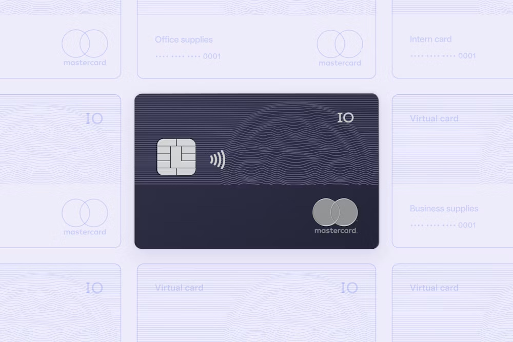
How we designed the landing page for IO by Mercury — turning a category built on fine print into one clear, checkable promise.
Read the case study
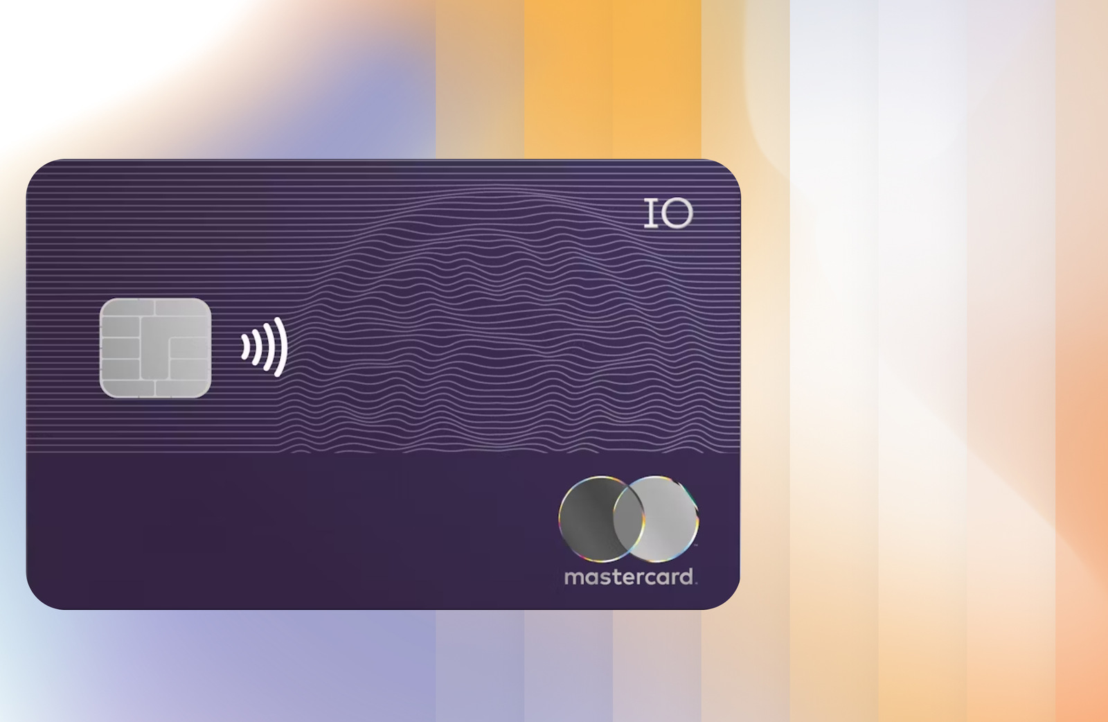
Mercury is the banking stack that 300,000+ startups and founders run on. IO is its business credit card — and its differentiator isn't rewards or rates. It's what the card doesn't ask for.
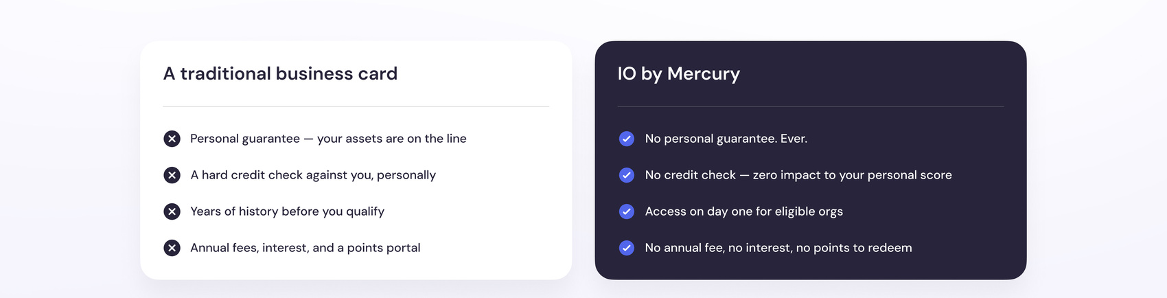
No personal guarantee. No credit check. A limit based on the money you already hold at Mercury, not on a founder's personal assets.
A personal guarantee means that if the company can't pay, you personally can. That one sentence is the whole reason founders distrust business credit — and nobody in the category says it out loud. So we led with it.
The product does exactly two things worth talking about. Rather than pad the page with features, we gave each one a full card and a picture of the actual outcome.

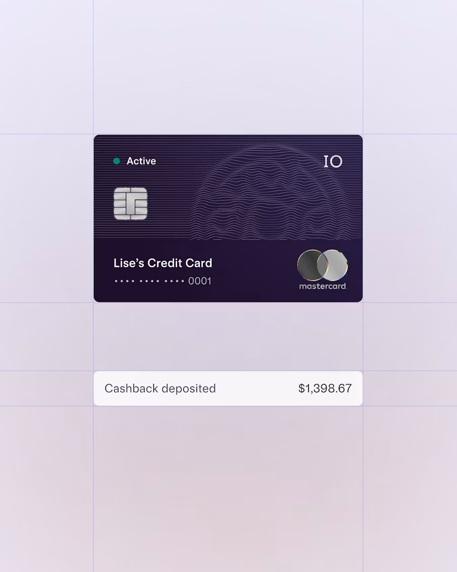
Every category, no cap. Deposited straight into your account when you pay the balance — nothing to claim, convert, or lose in a portal.

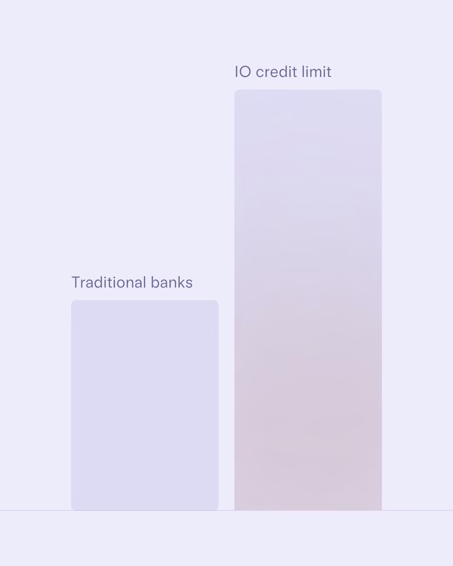
Not on a credit file. A funded company with a history gets a real limit on day one — and it grows as the balance does.
The mechanic most cards bury in the terms is the one that earns trust here — so we gave it two full-width blocks and photographed it like a product, not a footnote.
Lower balances start on daily terms — cleared automatically each business day. It's how you get a card on day one instead of waiting to build a history.

Switch to monthly repayment, deducted automatically. Pay early any time — cashback is credited in proportion to what you've paid.

The objection after "is it safe?" is "can I control it?" We answered it in the same breath — issue cards in bulk, lock them to merchants, and let the accounting reconcile itself.
In fintech, the strongest proof isn't a testimonial — it's scale. We put the numbers directly under the hero, then let real founders carry the emotional half of the argument further down.

"Unlike most financial institutions, Mercury is built on software. Everything can be done within the app in 1–3 minutes."

"We love Mercury's interface. Built-in permissions mean our accountant can easily make payments — literally one click and it's done."
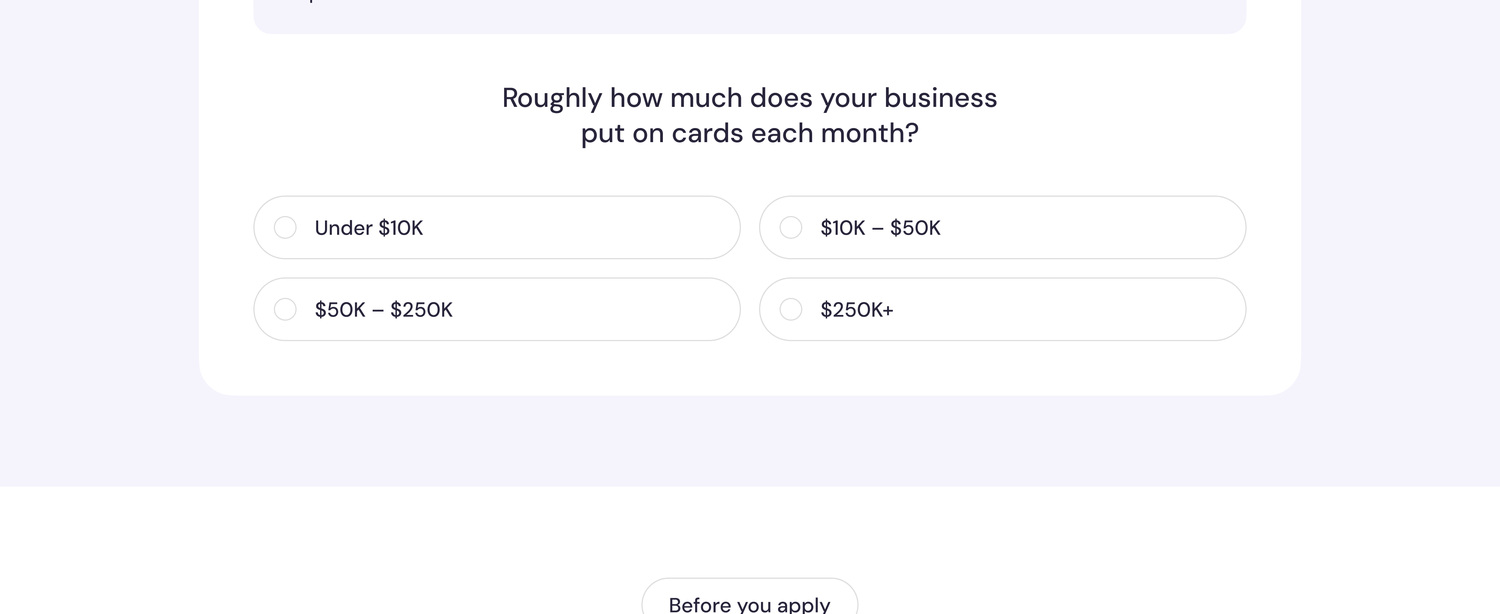
1.5% cashback is an abstraction. "$4,500 back a year" is a decision. Two questions — no email, no gate — and the page returns the buyer's own number.
A number they calculated themselves is the one they repeat to a co-founder.


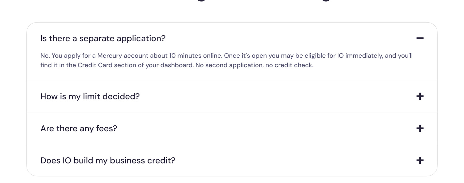
Is there a separate application? How is my limit decided? Are there fees? Does it build business credit? Four questions, answered plainly, right before the final CTA.
Naming the friction removes it. In a category this distrusted, an honest FAQ converts better than another benefit.
We design and build conversion-first landing pages for fintech, SaaS and regulated products — where the hard part is being believed.
You're viewing one of nine landing-page projects. Click any card below to open a different case study.